Usability Testing General Observations
This is a page where we can list general observations from the usability testing with or without recommendations. Anyone who administered or observed the testing should feel free to add notes.
It is very possible that some of the items here are already covered in JIRA issues.
We are still working on this page. Anything in italics are our thoughts from what we were seeing, not direct observations.
The tests can be accessed here: https://vimeo.com/album/3571591 (password shared on Slack).
Notes from Rice Testing
- it is really unclear what level an object is at in the hierarchy on its page
- search results have no context
- often the top results have titles that are identical, particularly names
- depending on how much description is done, it can be unclear what a component is if landed on via search
- not entirely clear what the component being described is
- when there are many agent links, the description is buried
Notes from Harvard Testing
- items have no clear indication of where to find the physical objects or how to request them
- collecting items in a citation manager would be helpful
- confusion between top search bar and text filter in sidebar
Overall highlights
Search results listing needs the most work. Among items that are confusing:
- Items in the list have the same titles, so user doesn’t have an indication of what they should click on (context would be helpful)
- Unclear what the items are (even where there are icons, this is still unclear)
- How to search (even under advanced search) isn’t entirely clear
Layout of item page:
- Would be helpful to put the description / summary / etc. up at the top
- Agent links are confusing
- Jargon (e.g. Components) is confusing
Most users are unsure of their position in the system by the time they’ve moved around a bit.
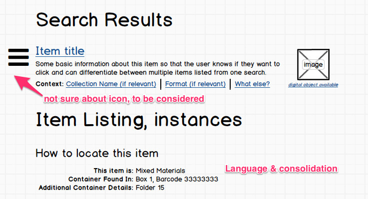
A very preliminary sketch for a couple of the elements that need to be addressed:
Cliffnotes from Rice 1
- Instances and Container 1/Container 2 confusing. Not really sure what they meant. Better language (e.g. where can this be found?)
- Details (e.g. abstract), type too small I would also note that grey on grey is a problem here b/c many of these users may not have the best eyesight or computers
- Long list of alphabetical files, not really sure what to do with them. Would be great if there were a way to search within components (this is there but is in another tab… maybe just at the top of the components list rather than in another tab?)
- This tester was putting advanced search queries into the search field. Might be worth offering instructions that are easy to access for users who might want to do the same and skip advanced search.
Cliffnotes from Rice 2
- Components - confusing term (what is a better term for this? This is not an archival term).
- Search results - need more than just title to help the user figure out what they want to click on
- Results that have no content should not be in the list
- Agent Links is very confusing. Related Subjects?
- More useful if the abstract etc. is at the top, and then related stuff is later on the page (or potentially sidebar it?)
- Like long descriptions in the lists of components, very helpful (rather than just giving title)
- WRC# to jargon what about a box that says “if you need this, here is what you tell us?"
- No clear way to tell which items are digitized
- Too easy to click on the home button
- Clear all button surprises you by clearing original search terms, not just the filters you have set on that search
- Breadcrumbs aren’t helpful as an indicator of where an item is placed, probably because of where it is located and how it looks? This information needs to be more clear
Cliffnotes from Yale 1
- Menu categories at top sound library-science and not really clear what their value might be
- Good to just start type away and search
- When many search results, the pager is not obvious and happens after too few items
- Would like to know what is in the box. Is this content entry or something we can put into the UI?
- Unclear how to get back to where you started — breadcrumbs not as helpful
- Misspellings when searching — Did you mean? realistic to potentially include that?
- If the title has a range in it, user expects to see the list of items. Is this a UI issue or a content entry issue? Perhaps a guide for how to enter content would be useful?
- Facets useful, but probably should be sorted alphabetically rather than diminishing number of items (or allow user to choose)
- Try to think about how search habits are conditioned by Google
Cliffnotes from Yale 2
- Make it more clear what kinds of things are found in ArchivesSpace
- Search history would be useful
- Something helpful on how to use advanced search
- Under advanced search, format would be useful
- Agent Links are confusing
- Unclear that scrolling needs to happen to get to the details on a record
- Visual difference in type (e.g. one item has all caps) confusing if it doesn’t have a clear meaning
- Not clear what Icons mean regarding what items are
- Search results show the collection level and component level results in one big blob and not clear what belongs where in that listing
Cliffnotes from Harvard 1
- Item names like “folder 1” not helpful is this a content entry issue?
- “Summary -> Agent Type” - typical user not sure what this means
- Unclear what numbers next to repositories mean (item counts)
- Search box, when using search box on a specific tab (e.g. subjects), is it searching just that tab, or everything? Not clear to user.
- Likes that the number of results is indicated on top of the search results.
- Would like to review the items that you found in a list (add items while thinking, then remove items before finalizing list)
- Easy access to submit a request would be nice
- Would be great if it worked with zotero or something else for citation management, or could create its own citation record
Cliffnotes from Harvard 2
- Likes clean, but blankness of home page a bit troubling
- Facets are nice
- Unclear on difference between collections and Accessions
- Would like to be able to search on call number right off the bat
- Some kind of icon key would be helpful (or some other method of indicating what things are)
- Had trouble getting to the digital object on the final test, too much clicking and unclear where it is located
- Collapsed components (and that organization) is helpful when on a specific item that has components
- In search results, context of items listed is missing
- Ability to sort facets?
, multiple selections available,