AS03b - Organization of Collection Page - Report
Overview
At the request of ArchivesSpace Development team member, Susan Pyzynski (Harvard University), Emilie Hardman (Houghton Library, Harvard University), with the assistance of Simmons intern, Anna Speth, designed and conducted a usability testing session on several areas of concern for the development of ASpace.
Tests were conducted at Houghton Library with six participants recruited by the Harvard Student Agencies on Wednesday, October 12, 2016. Participants were senior undergraduates or graduate students at Harvard University focused on work within the arts, humanities, and/or social sciences. Two participants could be classified as very experienced archives users, three had some significant-moderate archival experience with class assignments and personal research interests, and one participant had never made use of an archive or special collection.
The Test
This is a report on “part b” from the October 12 session which was focused on terminology and layout. In “part a” participants were asked to provide names for each component on a collection page. In “part b” they arranged their named component cards to illustrate what they would expect to be where on the page. Diagrams illustrating the participants' layouts may be seen here.
After participants had given names to each component, they were invited to lay all of the cards out on a large table to show where they would expect or hope to see them on a webpage. Participants were invited to verbally annotate their decision-making processes as they completed the task. After the cards had been laid out, participants were given pink cards and invited to use them to add any new data elements or functionality that they would want to have. Finally, participants were asked to indicate the components that would be most important and useful to their work.
Findings and Recommendations
Items of Importance
Summary:
A majority of participants indicated that the most important component for them was the abstract. Verbally they explained that this seemed like a quick way of learning more about the collection and determining whether or not they should spend more time learning about it. Most users chose to place the abstract such that it was one of the first items encountered on the page, offering immediate context for their encounter with the collection. The longer scope and contents note was something participants also thought was important, but less-so and they tended to want to “opt in” to more information about the collection and did not want it presented by default.
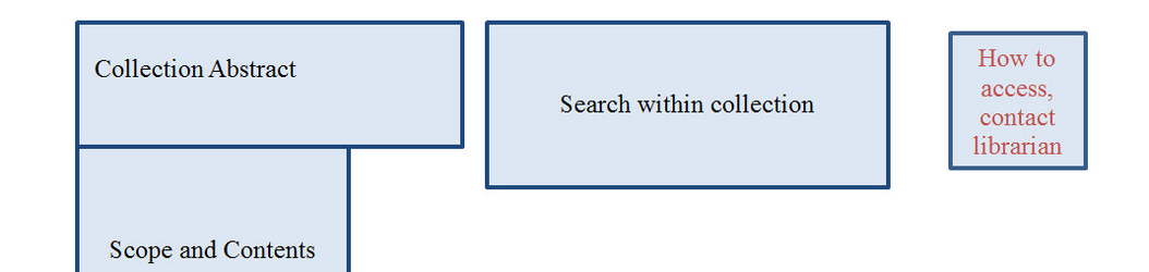
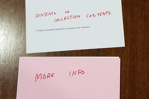
Search within a collection was also identified as a most important element, as was the table of contents. These two features would, participants said, serve different purposes: exploring versus targeted search, but both were key and they wanted to feature the prominently on the page. Most participants featured search prominently in their layouts.
Participants also overwhelmingly created “how to access” and “related collection” components for the page and rated them both as highly important. As these functions were generated by participants without prompting and rated as most important they seem particularly significant.
Several participants also mentioned that they would prioritize example photographs of the collection and that images of sample items in the collection would be helpful.
Recommendations
Maintain abstracts on collection pages in an always open (not collapsed) state and continue to provide abstracts on the collection search page. Add abstracts to the search results.
Consider adding a “read more” function to abstracts that would open up a scope and content note.
Restyle “search within collection” to make it clear that it works to search the contents of the collection and is a priority item visually on the page. Maintain proximity of search to contents but consider a header that points to discovery within the collection and subheaders for “search within” and “contents.”
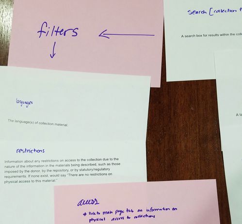
Add a component that will describe how patrons can access the collection. This may be link or button that will display repository-specified generic language about policies and procedures for access.
Information hierarchies and themes
Summary
Participants overwhelmingly moved several elements out of the main page, creating a second tier of information that would not draw their attention away from information and functions they identified as more important for their work in the system. 5 of 6 users omitted processing information, acquisition information, and the bioghist from the main collection page. Processing and acquisition information are more administrative element in nature and were not significant for a majority of participants in a majority of their work; participants wanted this to be reflected on the page so that these elements were not treated as of equal importance to information they required more immediate access to.
Almost every user also sorted the page elements into two or three different themes, aligned n distinct columns. By using columns or nested links, several users seemed to develop separate content and use themes. Content included things such as Abstract, Bioghist, Scope and Contents, and the Search within the Collection, while use included Citations, Access and Use Restrictions, and How to Access the Collection. Arrangement and scope were usually grouped together.
Recommendations
Bundle administrative data such as processing and acquisition information and present it at a lower level on the page.
The trickiness of <bioghist> raised in earlier reports is emphasized here again. Participants do not expect this site to provide them with this information or do not expect the information to be of the same quality they know they can obtain elsewhere and therefore see the data as a distraction. Considering the information landscape it may make sense to deprioritize this element. Conversely, the <bioghist> could be restyled to become a feature on the collection pages to emphasize its existence and highlight the potentially unique contributions it can make. Consider offering this information in the form of a sidebar populated with additional SNAC data and/or Google Knowledge Graphs.
Give users a clearer sense of what is about the collection in a broadly descriptive way and what the collection is in terms of its contents. This may be accomplished through labeling the columns to create clarity for users about the function of the elements which now occupy the majority of the collection page space and providing a label for the Contents and Arrangement sidebar that resonates and makes more immediate sense to users. Rebalancing of the page that does not relate the contents to a comparatively small sidebar. Featuring search, both within the collection and of other collections in this section could also be relevant to users.
Added Functions
Summary
The most often suggested addition to the collection page’s current elements was for a feature with instructions on how to access the collection. Without any prompting, 5 out of 6 participants added this feature, indicating that they would want to have details on access made very clear on the collection page; they did not want to hunt down this information elsewhere on the site.
The second most often suggested feature was a “related collections” section. Additionally, those who suggested these two features tended to mark them as very important, more so than many of the features already available.

participant’s card ranking this feature as a “1,” i.e. “most important” and indicating his strong feelings on the matter
Another feature requested by more than one participant was for pictures to be included. Conversation with participants who were interested in this feature emphasized that, though full digital access would of course be ideal, it was not expected or necessarily even needed. The image for these participants seemed to be a means of confirming the materiality of the collection and establishing some expectations for their encounter with the physical material at a later date.
Other features requested included: Scan and deliver options, specific lists of all of the formats (digital, photo, physical), a contact button for help from a librarian/archivist, a search button for the whole site, a photograph of the holding institution, a site user guide/faq, collection highlights, tags, ability to re-order contents (by date, alphabetically, by creator, origin, subject).
Several participants also hoped to make the terms used in the description of arrangement (date, alphabetical, subject matter) a function with the ability to sort or filter the collection. They also wanted buttons to create citations of collections and, importantly, components within the collection.
Recommendations
Add a component that will describe how patrons can access the collection. This may be link or button that will display repository-specified generic language about policies and procedures for access. This function is different from a request button to fulfill because it is not just about getting access to the material, it is about understanding the process, procedures, and policies that will govern access.
Consider ways of establishing a recommendation feature that will display collections with similar content. A SNAC module to display networks, or a feature that could make use of subject headings could meet this need.
Create a citation function that will work at the component and collection level. Unclear how or what the current, non-functional citation button will do.
For future development, it may be useful to think about ways that users can interact with the data in ways that offer them more personal and directly useful ways so they can sort and resort, filter, and expand.
Submitted by Emilie Hardman, October 28, 2016.