AS05 - Repository Page - Report
- Emilie Hardman (Unlicensed)
Overview
At the request of ArchivesSpace Development team member, Susan Pyzynski (Harvard University), Emilie Hardman (Houghton Library, Harvard University) conducted a usability session on the ASpace repository page (http://aspace.hudmol.com:7310/repositories/X).
Tests were conducted at Houghton Library with five participants on Thursday, November 3, 2016. Participants were junior and senior undergraduates or graduate students at Harvard University focused on work within the arts, humanities, and/or social sciences. Three participants had significant-moderate archival experience and two participants had light experience with archives or special collection.
The Test
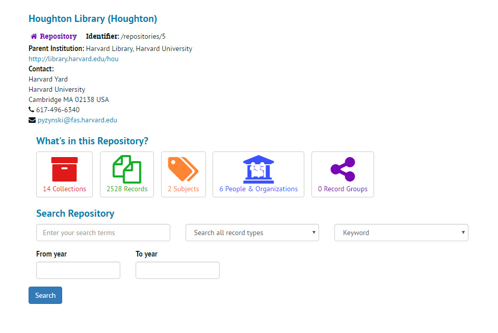
The session focused on the repository page generally and the five categories displayed on the repository page specifically: Collections, Records, Subjects, People and Organizations, and Record Groups. It probed the question of whether these were the most appropriate categories to meet user needs on this page and if they were labeled in a way that would provide users with a clear sense of their meaning. Participants were provided with a paper-based version of the repository page to enhance focus on the page itself and guided with semi-structured interview questions through it. At the time of the test the page provided to participants appeared in the following form:
The sessions were designed as semi-structured interviews and lasted between 15 and 20 minutes on average. Interviews were transcribed and the data analyzed with key themes noted as an overlay on the existing repository page. Based on the results of this work, a paper prototype was designed to address the areas of concern. This prototype was shared with a different group of archival and library professionals, as well as student library workers in an informally arranged A/B test. Based on this work, a redesigned repository page mock-up is offered for consideration.
Findings and Recommendations
In the following diagram, significant areas of concern are noted in New Times Roman font and circled in red. The themes below were noted because of the frequency of participant concern with an area. Frequency is noted in a x[#] format following the statement of concern.
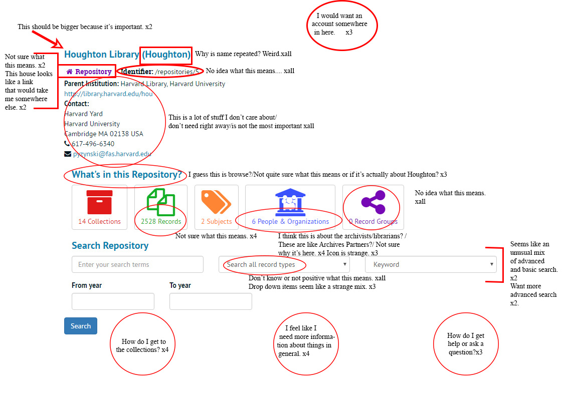 Areas of Concern
Header
Though the introduction to the test offered a framework for understanding the purpose of the page as a starting point for archival research at a specific repository, some participants struggled to understand the focus of the page. As they continued to discuss the page, two of them indicated that a larger header would be useful to stress the repository as an important feature on the page.
All participants questioned the repetition in parentheses of the repository name in truncated form.
Suggestions
Increase font size and draw on the accent Roboto Slab font used elsewhere in the site for the header.
Remove public display of the shortened repository name.
Repository Icon
Two participants indicated that the icon for the repository was confusing and that it looked like a link.
Suggestions
It may not provide much user value to maintain the repository icon and name. If retained, it may help to decrease the size of the icon and text.
Identifier
It has been clear in previous tests that the identifier is a source of concern for users and creates confusion. This user study yielded similar results with all participants pointing to it, often as the first element, actually, that provoked confusion or questions for them.
Suggestions
Remove from PUI.
Contact
Participants all, at one point or another, indicated that the contact information was either misplaced or not really helpful. More than contact information, what participants wanted was a way to get help or find out more. The address was useful only, some added, for planning a visit, which was not necessarily a first step and in that case, they would have preferred to have a map or directions, not just a static address.
Suggestions
Replace with a link to a form or other for questions, a map/directions, a policy page, and link to the repository's webpage for other/more information.
What's in this Repository?
Though it was not explicitly raised as a point of confusion for these participants, the term "repository," may have contributed to their sense that they didn't really know what this header meant or what it would allow them to do ("Repositories - how are they different from collections?" asked one participant). "I guess this is a browse area?" wondered several participants who further elaborated that they weren't sure if it was for the specific repository listed in the header above or for the whole site.
Suggestions
Follow the font choice at a smaller point level as the repository header above.
Move this feature under search so that users are offered an opportunity to take action in forming their own search first, but clearly follow with a labeled "Browse" feature.
Repository Icons/Sections
While it is possible that the participants were perplexed by the specific numbers, being generally smaller (or, as in the case of records, larger) than one might expect, they were a distraction for all participants in the study. In particular the mismatch between the number of collections and the number of records. "What's going on there?" asked a participant pointing to the thousands of records as compared to the double-digit collections.
Collections
This category seemed to make immediate sense to participants and they offered appropriate definitions for the kinds of things they would expect to find in this category.
Records
Almost all participants were unsure of what a record would mean in this context and what they would expect to find. They were unsure of the relationship between collections and the records. They indicated that they would not be likely to click on records because they did not know what they were and were overwhelmed by the number presented.
Subjects
In line with previous user testing, participants found the number of subjects presented to be troublesome and perhaps an indication of an error. They would want, they indicated, more subjects. Several participants also indicated that this would be the first area that they would be likely to click to explore, although the small number of subjects was a deterrent. This points to the utility of having subject access, but also the necessity for it to be a functional and user-supporting feature.
People and Organizations
A majority of participants expressed confusion with the “People & Organizations” option. Most participants initially thought that it would be a list of library staff or of project partners in ArchivesSpace. One participant found this comforting as it would be a way to talk to a real person for help if any issues arose. One participant understood that People & Organizations related to the collections, but expressed uncertainty about exactly what that relationship was.
Three participants also indicated that they could not parse the icon and found it very strange.
Record Groups
None of the participants understood what this was and suggested that they would be unlikely to click on it because it seemed unfamiliar and not helpful.
Suggestions
Remove PUI icons for Record Groups and Records.
Remove numerical references for the materials.
Develop new terminology for the problematic "People and Organizations." "Content Creators" did well among participants polled informally after testing. This label allows for a group of people icon (as below) which can stand for people and organizations.
Consider whether the subject browse is really ready to implement. Repositories may not have the metadata to back up this feature.
Search Repository
Suggestions
Simplify search on the main page and offer an advanced search option.
Provide more flexibility and clarity for date filtering.
Other
Suggestions
Implement the previously suggested link to a form or other for questions, a map/directions, a policy page, and link to the repository's webpage for other/more information.
Terminology and design that make the site feel specialized and the processes opaque for users seem consistently resonate through user testing. Suggestions made in previous user studies may help mediate these feelings for users.
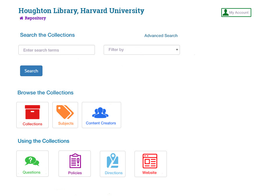
First prototype
Based on this feedback in user testing, the following prototype was developed:
Results
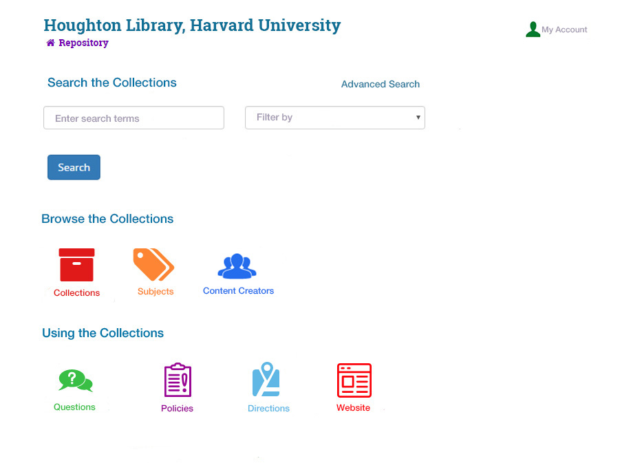
While all participants in the A/B test indicated a distinct preference for redesigned repository page layout, a majority pointed to the lines around the icons, either as a source of confusion ("why though are these all buttons?") or as an "annoying" design element. A second prototype was developed without the borders and shown along with the initial redesign in a second A/B test. While not unanimous, a majority of participants had a strong preference for the no-border repository page.
Suggested Layout Redesign
Submitted by Emilie Hardman, November 7, 2016