AS06 - Home Page - Report
Overview
At the request of ArchivesSpace Development team member, Susan Pyzynski (Harvard University), Emilie Hardman (Houghton Library, Harvard University) conducted a usability testing session on several areas of concern for the development of ASpace.
Tests were conducted at Houghton Library with six participants recruited by the Harvard Student Agencies. Participants were senior undergraduates or graduate students at Harvard University focused on work within the arts, humanities, and/or social sciences. Two participants could be classified as very experienced archives users, three had some significant-moderate archival experience with class assignments and personal research interests, and one participant had never made use of an archive or special collection.
The Test
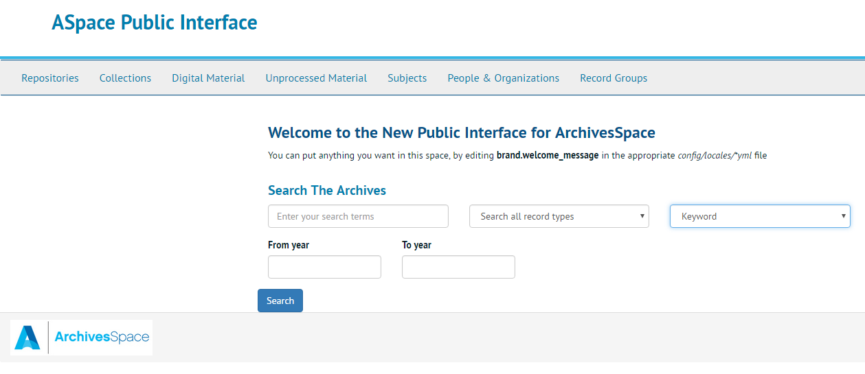
In this section of the session, participants were presented with a paper version of the ArchivesSpace homepage guided with questions and prompts to determine the appropriateness and applicability of functions and labels. At the time of testing, the homepage appeared in the following form:
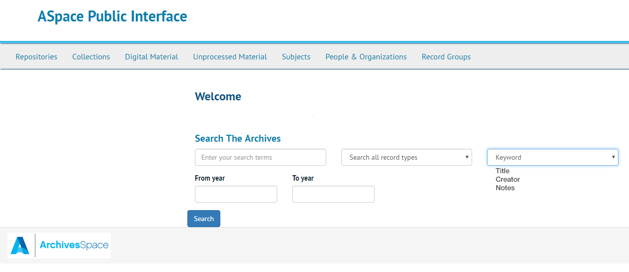
For the purpose of the session, a screenshot of the interface was edited to remove potentially distracting QA-specific elements, such at the brand.welcome prompt and the "Welcome to..." message. Because the session was conducted with a paper version of the main landing page, the dropdown menus were not available to participants, so the options were presented separately. Participants were encouraged to discuss their understanding of various elements on the page and to detail their expectations and potential behaviors. They were also offered markers to edit the page, adding elements, noting questions, etc. The page as presented to participants took the following form:
The conversations were transcribed and the paper homepages analyzed with the help of assistance of Simmons intern, Anna Speth.
Findings and Recommendations
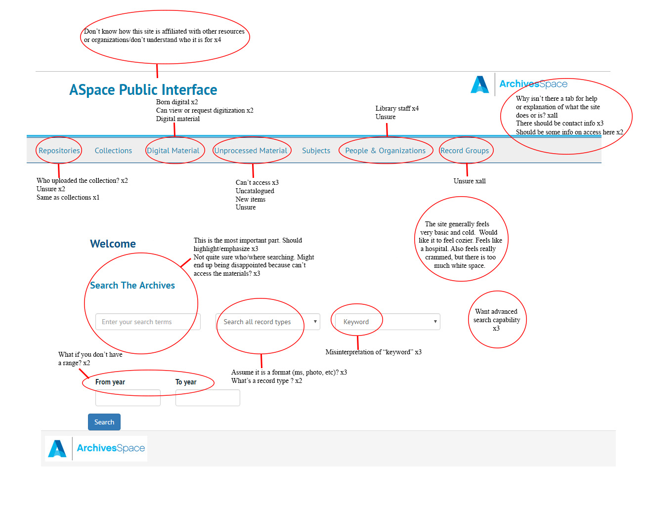
The following marked-up homepage points to some potential areas of concern when considering the data from all participants.
Areas of Concern
Belonging
Suggestions
Encourage sites to have strong brand identity carry through their discovery platforms and to create links back to resources to tie these together for users.
Navigation Bar
Repositories
Only two of the respondents who commented on this link had a strong and appropriate sense of what might be meant by repository in this context. Interestingly, these respondents both used the same language to describe a repository, identifying it as a place which "uploaded" collections. They understood the responsibility a repository bore for the collections, but their language also belies a sense that the collection materials would all be represented digitally on the site.
Digital Material
There was little cohesion around the idea of what "Digital Material" might mean in this context. Some participants, savvy in the ways of archives and special collections, indicated that this was likely to be a place where born digital material might be accessed. Two participants suggested that they would look to this area for both materials that have been digitized and to make requests for materials to be digitized, while another thought it would just be where the digitized materials would be. In general, participants thought it was good to identify digital materials so that if they were in a hurry and unable to go to an archive or special collection, they would be able to focus on materials that could be accessed digitally. While participants indicated support for a quick and easy way to get to digital material, several thought it was strange to only look for digital materials because they sensed that most material would not be available digitally and wondered if this would also be the only place to find digital materials.
Unprocessed Materials
A majority of participants indicated that unprocessed materials were materials that they could not access ("Unprocessed materials -- when I see that I think I’d find [collections] that are undergoing work and can't be seen. So, why would you go there? I guess I don’t know why I would go there.") Because the materials did not seem accessible, participants suggested that they would be very unlikely to look in this area unless they were not able to find something of interest elsewhere.
An experienced participant noted that this was probably an area for materials that hadn’t been cataloged yet and that she would "check it out to see if there is anything new or that I haven’t seen elsewhere."
People and Organizations
As in testing on the repository page for ASpace, participants primarily misinterpreted "People & Organizations." The consistency with which participants mis-characterize the purpose of this section is also notable; it is generally understood to be an area with information about library or archives staff.
Record Groups
No participant was able to characterize this section, and further, they declined to even hazard a guess. While one participant said she would be likely to look at it because she didn't know what it meant and it could be interesting, others noted that they would be very unlikely to explore this area because it was not clear to them what it meant.
Suggestions
Default/out-of-the-box terminology may be adjust to support a more user-friendly environment and create clarity around the navigational elements. Synonyms suggested by the participants who correctly characterized the nature the repository tab were "Contributing Archive" or "Library." In previous testing, the terminology of "Content Creators" was proposed. Further testing may be done on this proposal, but some solution does appear to be needed as the purpose of this section is entirely opaque to participants, across testing groups.
While participants indicated support for a quick and easy way to get to digital material, they also pointed to concerns around discovery and a lack of clarity regarding the presence of digital materials elsewhere. Filters for digitized or born digital materials in a search mechanism may be more effective for most users. Further, since a majority of the participant's expectations would not be met with this tab as is, some consideration of its purpose and placement is warranted. The same seems true for the Unprocessed Materials and Record Groups sections. It is not clear that these tabs are serving specific user needs or supporting majority behaviors for any user type. It may be more effective to present these results within the larger search function and implement template text or an icon to serve the identified user needs for information that may change access policies and procedures.
Help/FAQ
Suggestions
Implement a new section which offers this information to users. Sections in may organized along the lines suggested in the repository page test.
Search
Suggestions
Simplify search on the main page by removing the two dropdown options and offer an advanced search option. Consider filtering options and terminology against developed user stories.
Dates
As in repository page testing, participants pointed out that they would not always want to search a date range.
Suggestions
Provide more flexibility to support searching for a specific date. Consider design solutions that would enhance clarity around user's stated desire to search just from or to, but not necessarily both.
Look and Feel
Most of this will be addressed by local implements, but it is still important to note that the space does not feel appropriately used to participants. The reaction a majority of participants have had to the look and feel of the site is strongly opposed. Participants wish for a strong sense of purpose and productive possibility in the site and do not feel that it delivers. Some of this is design, but some also seems to relate to the issues discussed throughout with terminology and a lack of key functions and information which leave participants feeling that they don't quite know what can be done with this site.
Suggestions
Some of the same ideas participants raised in AS03b would be applicable to the homepage as well.
Submitted by Emilie Hardman, November 8, 2016