AS04 - Guided Site Use Interviews - Report
- Emilie Hardman (Unlicensed)
Overview
At the request of ArchivesSpace Development team member, Susan Pyzynski (Harvard University), Emilie Hardman (Houghton Library, Harvard University), with the assistance of Simmons intern, Anna Speth, designed and conducted guided interviews to explore the user experience of the ASpace PUI.
The session was conducted at Houghton Library with five participants recruited by the Harvard Student Agencies on Wednesday, October 12, 2016. Participants included two senior undergraduate students and three graduate students at Harvard University focused on work in the arts, humanities, and social sciences. Two participants could be classified as very experienced archives users, two had some significant-moderate archival experience with class assignments and personal research interests, and one participant had never made use of an archive or special collection.
The Session
Participants were given a scenario to use as context for their encounter with the ASpace site. They were told that they were working on a research paper about ballet and that a professor had required they make use of archival material in the research process. Participants started the session on the Houghton Library repository page, and were guided with prompts throughout their use of the site [script: https://drive.google.com/drive/u/1/folders/0B2YxlvJUmvncTDJPR0Vmbmp5S00]. Participants were asked to narrate their thought processes and actions throughout.
Findings and Recommendations
Overall, there was remarkable alignment in the participant’s experiences throughout this session. Participants struggled to understand the search algorithm and expressed confusion over the search results returned. As observed in earlier tests, this seemed to undermine participants’ trust in the site. Participants also broadly lacked confidence in their selections, not sure if they had enough information to make selections in fulfillment of their goal. When looking at component pages, “maybe I’m not clicking it correctly...it’s not downloading or linking to anything,” was an observation made by a majority of participants in a variety of different ways. The perceived lack of information about materials proved in this session to be as confusing for participants as in earlier tests. Participants were also uniformly unsure of how they would physically access materials.
Subjects Page
Summary
Most participants used the search box, but two clicked on “Subjects” in the top navigation bar to look for ballet there. After expressing disappointment over not having access to a search bar on the “Subjects” page, participants clicked through 6 pages, only to find that ballet was not a subject. These participants had to be encouraged to try another method of finding results because they indicated that there did not appear to be materials on ballet for them to complete the task with. One participant commented, “it’s kind of hard to search for things right now...if you know exactly what you are looking for, maybe it’s not that bad. For exploring it’s kind of difficult.”
Recommendations
Consider carefully the value of offering a subject page at this point. The underlying data may not be sufficient to meet user expectations or needs. It may in fact be detrimental as users determine that either materials related to their subjects of interest do not exist or that the system is flawed and incapable to providing them the information they need.
Provide search boxes on all pages (e.g. Collections, Subjects, etc.)
Search Results Page
Summary
Participants overwhelmingly stressed the necessity of having a functioning date filter at the initial search and as a way to filter and arrange results. All but one participant attempted to use the date filter before being redirected by the study moderator who noted that currently the filter was not functional. Participants noted that this was a critical feature for them.
After performing an initial search, a majority of participants delayed for between four and ten seconds on the results, staring at the page without scrolling or speaking. Participants then tended to move their attention to the filters on the right side of the screen in an attempt to gain context and control over the results.
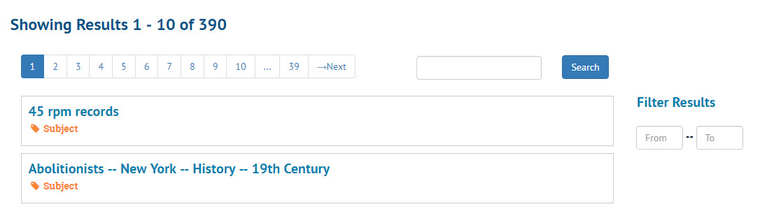
Screenshot illustrating participant’s focus on filters after landing on search results.
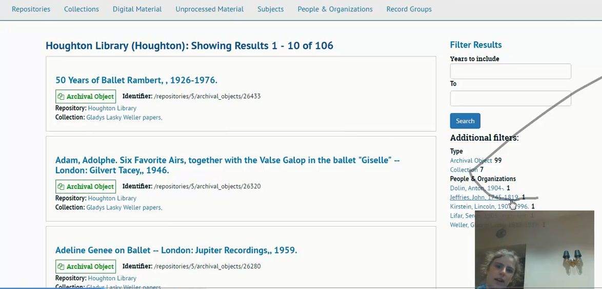
After looking at the page for some seconds, most participants chose to limit their results to collections using the sidebar filter, though some also toggled back and forth between records and collections. For participants who conducted searches which offered them subject filters, an initial sense of excitement was dulled upon the realization that the kinds of subjects they would be interested in were not available. Participants expressed a feeling that there was a paucity of subjects on offer and that, further, subject and format were conflated. One participant explained, “I want to sort by object types, things like that--kinds of media, manuscripts, letters, paintings, but also like 17th century, or dance and teaching. Those aren’t the same groups of things to sort out, right?”
On the search results page, participants generally struggled briefly with the concept of an “archival object” and it was not clear that most of them understood that these results were components of collections.
Several participants commented on the order of the results list. They assumed that there was some significance to the order, as there is with Google (which was evoked frequently). One participant determined that the results were returned alphabetically and showed visible disappointment.
Confusion over the results was amplified when participants moved into the collections. One participant was clearly confused when she clicked on a collection that had been returned by a keyword search on “ballet,” then searched within the collection for “ballet,” and received no results (“How can that happen?”). Another participant frankly stated after examining some of her results that, “I guess I don’t know how the search works.” This is in keeping with previous user testing, where users expressed confusion and frustration with the search results.
Participants also overwhelmingly expressed a desire to be able to reorder the results themselves. Date reordering was the primary interest, but participants also indicated that they were interested in other means of ordering, filtering, and refining so that they could create a more useful set of results for their research topic.
Recommendations
Prioritize a fix for date filters on initial searches and within search results.
Carefully consider search algorithm and original order of the results page. Be transparent about order of the results to clarify user assumptions about relevancy.
Present collections first or exclusively in the search results.
Consider design solutions that will highlight the filters. The current position of the filter sidebar is not aligned on the x axis with the beginning of the search results, which may make it less obvious to users.
If/when presenting archival object results, clarify the relationship between objects and collections. A design may be useful in this regard. Current design has the icon and its inheritance on separate lines below the component title, e.g.:

Flipping this structure and turning it into one line may offer more clarity, e.g.

In this redesign, the position of the icon and inheritance make it clear that what follows is part of the collection referenced, while the comparatively smaller font size keep a primary focus on the component. The current font size (2 pt. smaller than this recommendation) and position under the component title seem to challenge study participants’ efficient understanding of results. Informal A/B testing with these two views presented as a paper prototypes demonstrated a unanimous preference for the redesign.
Offer users an opportunity to obtain more information from search results. Consider offering an abstract at the collection level and format/s at the component level.
Provide users the ability to reorder search results based on date, format, creator name, language, location, availability, etc. to allow for more focused, personalized and useful searching.
Consider carefully the value of offering subject filters at this point. The underlying data may not be sufficient to meet user expectations or needs.
Collection Level Page
Summary
Upon opening a collection level page, most participants indicated that the “Scope and Contents” and “Content & Arrangement” areas were useful and encouraging, but these observations were also the primary point of divergent experience for this session. Some participants focused on “Scope and Contents” and others on “Content & Arrangement.” They were not initially used by participants as intended, which is to say, in conjunction with each other.
A majority of participants seemed to experience persistent confusion about how the collections they were looked at related to the search that they had performed.
In examining results, participants struggled to determine just how useful the materials described would be to their research. To a person, when looking at component descriptions, they noted that there was not enough information for them to decide whether the materials justified a physical trip to the library. Several participants noted that they would probably just identify some collections of interest and then ask a librarian or archivist about what to do next.
Participants who focused on the “Scope and Contents” all clicked through several drop down elements to orient themselves to the collection broadly. This behavior seems to support the recent addition of the “Expand All” button. There was broad confusion about “Conditions Governing Access” and “Immediate Source of Acquisition.” This bolsters findings in other tests that this language is not broadly useful or descriptive for users.
Recommendations
Restyle the “Contents & Arrangement” bar to better emphasize its importance and establish a stronger relationship to the narrative description of “Scope and Contents.” These two elements really seem to require a stronger and more direct relationship for users to make sense of the finding aid.
See AS03 tests for recommendations on language and layout.
Deeper Level Display
Summary
These pages, from series to item level, proved the most confusing for participants, which has been a theme across the ASpace PUI testing. Participants appeared to understand the breadcrumbs in terms of navigation but not context. This is in line with previous ASpace PUI tests. One participant, after navigating to an archival object directly from the search results list, stated “this does not help me.” The participant described the information that she wished to see on the page, essentially contextual information included in the scope note. She did not find the breadcrumbs useful or figure out how to use them to gain the context she sought.
The layout of “Contents & Arrangement” was a source of frustration in the session for all participants as they transitioned from the collection level view. They all articulated some version of the complaint that there was too much white space. They also pointed out that the relegation of the contents to a small column on the side of the page made it look unimportant. This second point was returned to with recrimination as participants realized it was instrumental.
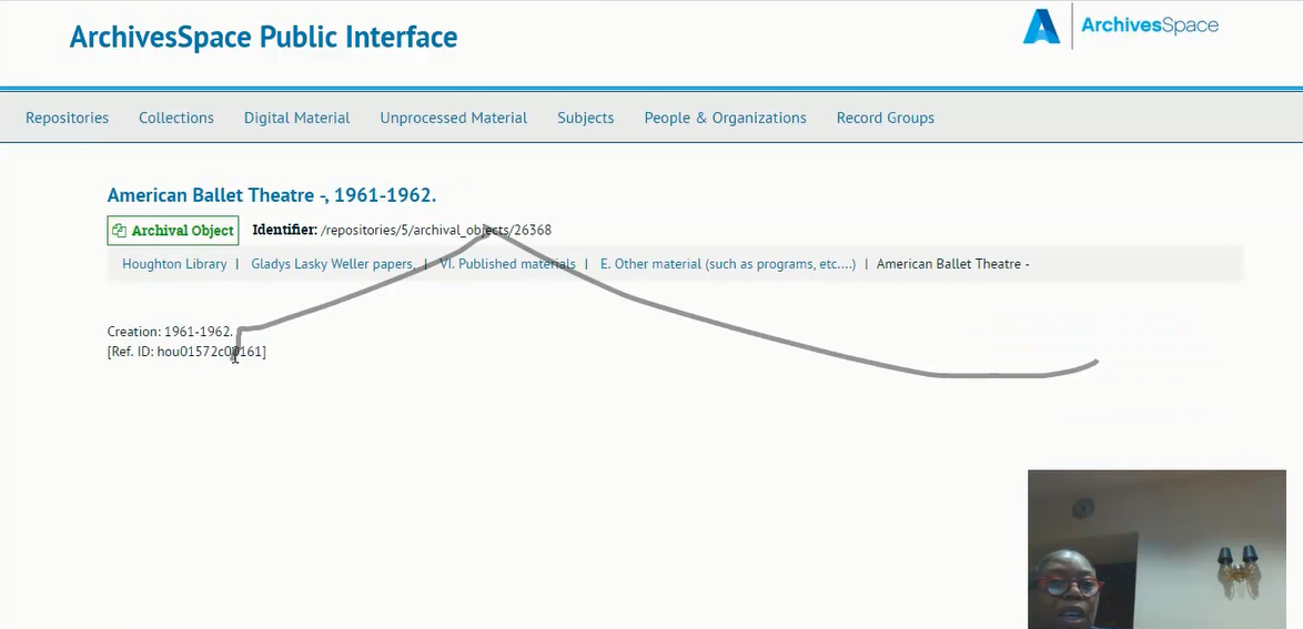
The participants all found the general layout of the component pages “off-putting” and “confusing.” When clicking from the collection page into a series, one user narrated, “Let’s see what happens. [clicks] What happened?! I don’t know. This is weird. This is ugly, I don’t like it. What? What?” While the “Contents & Arrangement” bar sits on the side of the screen, the Ref. ID takes center stage which overwhelmingly caused confusion amongst participants, both in this test and in other ASpace usability tests. One participant articulated that the Ref. ID must be important because of its prominence on the page, and perhaps if she knew more about archival research she would know what it was. Because of its prominence she felt like she should be using it, but she just didn’t know how. This highlights a sentiment expressed by users in AS02: the site undermined their confidence and made them feel unqualified to do archival research.
The majority of participants repeatedly requested information about the format of materials. This occurred throughout the search and exploration process. The sentiment of “I don’t know what this is” was repeated in one way or another by a majority of the participants. When format was made available, participants expressed gratitude for it. One participant commented positively on the list of formats in a scope note, and another noted appreciation for a breadcrumb trail that involved a series titled “pamphlets and brochures.” Certainly, these are issues most specifically tied to the archival data itself, but they should also be of concern for ASpace development. Users expect the site to be show them the available formats in concrete terms and this is another issue related to the atomization of data which, as handled in the PUI currently, divorces components from the context of the collection and series which may be where format is specified.
Screenshot taken while participant narrates, “I don’t know what it is. It should be a book or something.
I don’t know. I have to think it might be a book, it could be anything because it’s not telling me.”
Recommendations
Provide hierarchical context beyond the breadcrumb bar. Offer a sidebar table of contents for users. Highlight the user’s place within the table and maintain a view of the whole table.
Restyle archival record pages. Expand and highlight “Contents & Arrangement” bar.
Replace identifiers with more important context such as format, extent, and date. Look for ways of managing inheritance for components.
Requesting Items
Summary
Another thread of confusion across all test participants involved accessing materials. Though the script specified that digital access was not common, some participants still assumed or hoped materials would be available online. Others did understand that they would need to go to the library or archive to see the collection materials, but were unsure what library or archive to go to or what information to bring with them. This was true despite the session opening on a specific repository page and the presence of a repository on the collection page and as a top level in the breadcrumbs. Participants were also unsure of how to ask questions about the collections. One participant indicated she would contact the archivist who worked on the collection.
Participants uniformly expressed frustration over the lack of clarity regarding how they were meant to arrange for access materials. Even before they had located specific items of interest (and in fact, most participants did not ever get to that point), they wanted to know how to they would accomplish this task.
One mentioned that she “assumed they are at the Houghton” but was not sure. Another said that she had “no sense where they are” even while hovering the mouse over “Houghton” in the breadcrumb trail. A third said, “I’m not even positive it’s at Houghton because if I click on Houghton, I go to that page [the repository page] and it doesn’t have anything to do with where I came from.” Another mentioned that she did not like that you had to navigate away from the material to find information about how to view it.
One experienced archival user wanted to be able to save the materials she wanted to see and was frustrated by the lack of an option to maintain an ongoing list.
Recommendations
Create clear directions on how to access material that travel across all levels.
Provide a button for a form which scrapes context (e.g. collection name, link to specific location from which form was initiated) and offers user the space to ask a question.
Expand on the development of “Found in: [Repository]” by adding similarly appropriate language to the collection page and breadcrumbs, e.g. “Part of [Repository]’s Collections.”
Maintain the addition of the “request” button and consider implementing “shopping cart” feature. Note that “request” certainly seems to carry different user expectations; provide clarity around options for digital and physical access.